Tuesday, 27 November 2012
Saturday, 24 November 2012
Friday, 23 November 2012
Wednesday, 21 November 2012
Blog checklist
2. Identify and explain choice of music genre
-
post pics of bands and
youtube vids etc.
3. Market
research into existing magazines that
work within the same music genre as yours (e.g. they are competition). Analyse
the conventions of each of the following using LIIAR:
- Front
page
-
Contents pages
- Double
page features4. Target audience
Refine
your ideas of target audience using demographics and psychographics - see
powerpoint slide for help.
- Audience research (existing
reader profiles) e.g to be posted on blog with a minimum 250 word summary
- Demographics
explanation/definition and a table of the grading system A, B, C etc. minimum
200 word paragraph explanation
- Uses and gratifications model
research in the theory referencing all books and internet web pages (300 word
minimum write up)
- Focus group: Planning and recording
posted on to blog
5. Price
5. Price
How often will your magazine be
published and why? (relate back to your refined target audience e.g. what can
they afford?)
6. Initial ideas based on your market research
6. Initial ideas based on your market research
(thought
showers, hand drawn drafts etc - scan them in on the scanner in the edit
suite).
-Mood
board and initial ideas spider diagram
7. Digital mock ups using found images
7. Digital mock ups using found images
can be
done on Photoshop / Publisher - remember to save as .jpg files
-
Other inspirational
ideas that pull together your genre in relation to styling and planning a shoot
8. Planning / development:
Stage one: Set design and styling initial ideas
-Initial idea mock up front cover, contents
page and double page spread ICT
-initial idea mock up front cover, contents
page and double page spread HAND DRAWN
-Costume ideas
-Mise-en-scene/ location ideas
-Lighting ideas
Remember, you have three products
to produce and all of the images need to look like they belong together. Post
all of them (or a selection of the best) to your blog and explain your choices.
- Maybe you could film your
photoshoot and load it onto your blog.
- Start mocking up ideas (can be
done on Photoshop / Publisher - remember to save as .jpg files)
Production:
9. DRAFTS!!!
- Do absolutely loads of these in
Photoshop.
- Save your work as a jpg. Every time
you think that you are finished, get some feedback, post the feedback, then do
ANOTHER draft!
*REPEAT STAGES 7, 8 & 9 for each of
your products e.g. Front cover, contents page, double-page spread*
10. Write your article and post it.
- Get it checked.
- Get it checked again.
- Repost it with mistakes
corrected to show your dedication to perfection.
11. Final products posted.
11. Final products posted.
12.
Suggest how you would promote the launch of your magazine on the
internet e.g. viral marketing campaigns.
- Perhaps you could even mock up
a homepage for your magazine's own website based on research into existing
magazines and their websites. maybe you could www.wix.com
- Suggest how the relationship
between the online and print version of your magazine would work e.g. what
would be in the print version to make people BUY it rather than looking at it
for free online? What are the benefits of engaging the audience via the
website?
13. Audience feedback on your final products and ideas for your online version.
14. Respond to audience feedback in LIIAR evaluation of your own work.
15. Do ANOTHER draft of all three products for MAXIMUM geek-osity :o)
13. Audience feedback on your final products and ideas for your online version.
14. Respond to audience feedback in LIIAR evaluation of your own work.
15. Do ANOTHER draft of all three products for MAXIMUM geek-osity :o)
First photoshoot
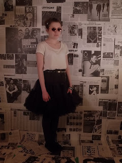
Here are some of the photos from my first photoshoot, I used this shoot to get used to the camera and try out angles and poses to use in my second photoshoot.
Tuesday, 20 November 2012
Friday, 16 November 2012
My practice photoshoot
My practice photoshoot
This is a long shot with the use of lighting.
This is a long shot without the use of lighting.
This is a medium close up witht he use of lighting.
This is a medium close up without the use of lighting.
This is a mid shot.
As you can see the image looks much better and proffesional with the use of lighting, as a much more defined focus is put on the main feature of the shot.
Tuesday, 13 November 2012
Geek chick
This 'geek chick' look is what i am aiming for my artist to look like on the front cover of my magazine, so this video is helpful as it has given me some fashion ideas of how to make this look happen :)
Thursday, 8 November 2012
Wednesday, 7 November 2012
Subscribe to:
Comments (Atom)


